Shared from Danubius IT Solutions' tech blog.
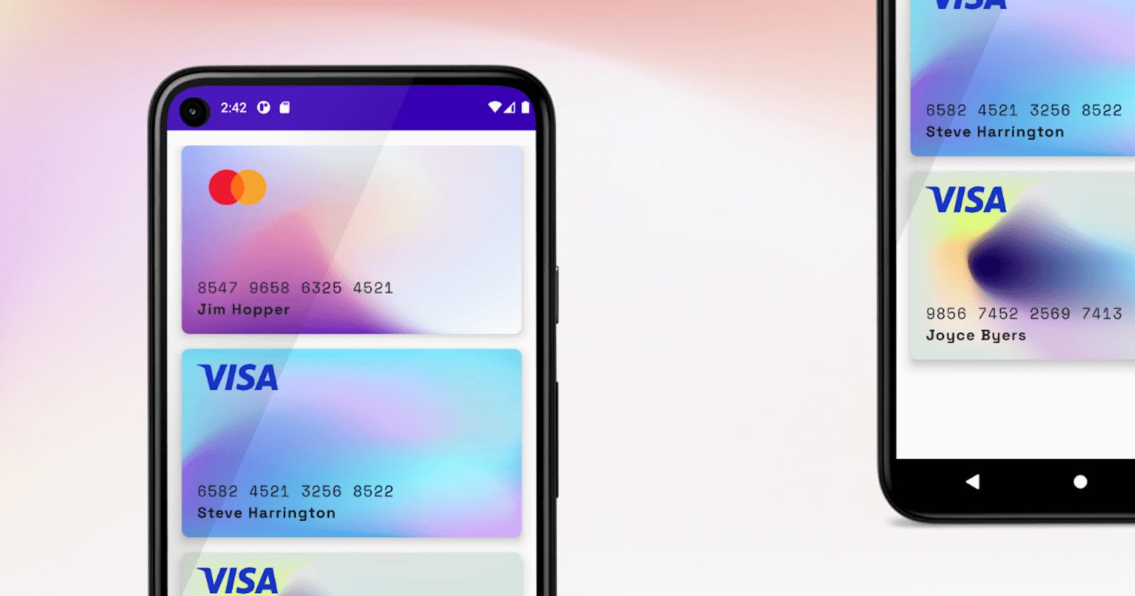
This fast tutorial shows how to create a list of credit cards with JetPack Compose. Just follow the steps and try out Google’s declarative UI framework today!
Prerequisites
The latest version of Android Studio
JDK 11 or higher
Physical or virtual device for testing
Anatomy
The idea is very simple: Create a card, add a mesh gradient image, put over a box layout and take the parts to the right places. The key is the Box layout. With this composable, you can put elements in the 4 corners of the box. See the reference docs for more about Box layout.
Prepare
First of all, create a new Android Project and select Empty Compose Activity. Then clean up the sample code.
Get the image and font resources:
Visa logo
MasterCard logo
Space Mono font
Space Grotesk font
Some mesh gradients
Put image resources to /res/drawable.
Create a new resource folder for fonts: /res/font and copy font files (Space Grotesk bold for cardholder name and Space mono regular for card number).
Create CreditCard() composable
Create a new Kotlin file under the ui package and name it CreditCard.kt. Start a new composable function and add empty Card() component:
@Composable fun CreditCard() { Card( modifier = Modifier .height(200.dp), shape = RoundedCornerShape(8.dp), elevation = 8.dp ) { } }
Add Image() inside card content for the mesh background:
@Composable fun CreditCard(cardInfo: CardInfo) { Card( modifier = Modifier .height(200.dp), shape = RoundedCornerShape(8.dp), elevation = 8.dp ) { Image( painter = painterResource(id = R.drawable.card_mesh), contentDescription = "Card Background", contentScale = ContentScale.FillBounds ) } }
The FillBounds content scale will expand the image to match the size of the card.
After the image, put a new Box() layout with some padding:
Box(modifier = Modifier.padding(16.dp)) { } Add Image() to the Box TopStart position and load the Visa logo. Box(modifier = Modifier.padding(16.dp)) { Image( painter = painterResource(id = R.drawable.visa), contentDescription = "Visa", modifier = Modifier .width(86.dp) .align(Alignment.TopStart) ) }
Prepare the font faces to use for card number and cardholder texts. Open ui/theme/Type.kt and create new font families:
val SpaceMono = FontFamily( Font(R.font.space_mono_regular) ) val SpaceGrotesk = FontFamily( Font(R.font.space_grotesk_bold, FontWeight.Bold) )
Now you can use them in other composables.
To align the card number and the cardholder name under each other, we will use a Column() wrapper component and put the Text() inside it.
Box(modifier = Modifier.padding(16.dp)) { Image( painter = painterResource(id = R.drawable.visa), contentDescription = "Visa", modifier = Modifier .width(86.dp) .align(Alignment.TopStart) ) Column(modifier = Modifier .align(Alignment.BottomStart)) { Text( text = "5435 9876 1234 6543", fontFamily = SpaceMono, letterSpacing = 1.2.sp, fontSize = 16.sp ) Text( text = cardInfo.cardHolder, fontFamily = SpaceGrotesk, letterSpacing = 1.1.sp, fontSize = 16.sp ) } }
Showtime
The CreditCard() composable is ready to use, put inside your app component:
@Composable fun DiCardApp() { DanubiusCreditCardTheme { Column( modifier = Modifier .fillMaxHeight() .padding(16.dp), verticalArrangement = Arrangement.spacedBy(16.dp) ) { CreditCard(cardInfo = CardInfo( backgroundDrawable = R.drawable.card_mesh, providerDrawable = R.drawable.mc, cardNumber = "8547 9658 6325 4521", cardHolder = "John Fluffy" )) } } }
More than one
Create a new data class to hold the attributes of a CreditCard() composable, for example CardInfo.kt.
data class CardInfo( val cardNumber: String, val cardHolder: String, val providerDrawable: Int, val backgroundDrawable: Int )
Create a fake list of cards:
val cards = listOf( CardInfo( backgroundDrawable = R.drawable.card_mesh, providerDrawable = R.drawable.mc, cardNumber = "8547 9658 6325 4521", cardHolder = "Jim Hopper" ), CardInfo( backgroundDrawable = R.drawable.card_mesh_2, providerDrawable = R.drawable.visa, cardNumber = "6582 4521 3256 8522", cardHolder = "Steve Harrington" ), CardInfo( backgroundDrawable = R.drawable.card_mesh_3, providerDrawable = R.drawable.visa, cardNumber = "9856 7452 2569 7413", cardHolder = "Joyce Byers" ) )
Change Column() component to LazyColumn() and load the items of cards list.
LazyColumn( modifier = Modifier .fillMaxHeight() .padding(16.dp), verticalArrangement = Arrangement.spacedBy(16.dp) ) { items(cards) { card -> CreditCard(cardInfo = card) } }
Refactor the CardInfo component to display CardInfo object attributes. See the final implementation below:
@Composable fun CreditCard(cardInfo: CardInfo) { Card( modifier = Modifier .height(200.dp), shape = RoundedCornerShape(8.dp), elevation = 8.dp ) { Image( painter = painterResource(id = cardInfo.backgroundDrawable), contentDescription = "Card Background", contentScale = ContentScale.FillBounds ) Box(modifier = Modifier.padding(16.dp)) { Image( painter = painterResource(id = cardInfo.providerDrawable), contentDescription = "Visa", modifier = Modifier .width(86.dp) .align(Alignment.TopStart) ) Column(modifier = Modifier.align(Alignment.BottomStart)) { Text( text = cardInfo.cardNumber, fontFamily = SpaceMono, letterSpacing = 1.2.sp, fontSize = 16.sp ) Text( text = cardInfo.cardHolder, fontFamily = SpaceGrotesk, letterSpacing = 1.1.sp, fontSize = 16.sp ) } } } }
That’s it! You can play around with other backgrounds, fonts, and layouts. You can find the full example on GitHub in this repository. Don’t forget to ⭐️ the repository.


