
Information system design with a UX mindset
How should we organize information well?


This article was originally published on Danubius IT Solutions' tech blog.
It's essential for a good user experience that we can find the information we are looking for as quickly and smoothly as possible. When designing digital interfaces, it can easily happen that a large amount of data is exhaustively sorted into categories, and then our straightforward arrangement is still illogical to the end user, the labels on buttons and menu items are fuzzy or confusing, and data changes/updates can disrupt a previously well-functioning system.
We can conclude that there are many steps to fail in creating a hierarchical framework, but perhaps what we can grow on is the idea that we should not exclusively implement our own design/development ideas, but rather try to map the search logic of the majority of our users. The good news is that we have several methods available to gain a deeper understanding of user decisions. By making our intuitive decisions more conscious, we can elevate our product to a higher level of user experience. But let's see it in practice!
It is indeed true that ‘good information architecture is invisible to users; however, it is important to discuss it, and visualize the system’* To facilitate visualization, the following four steps can be helpful:
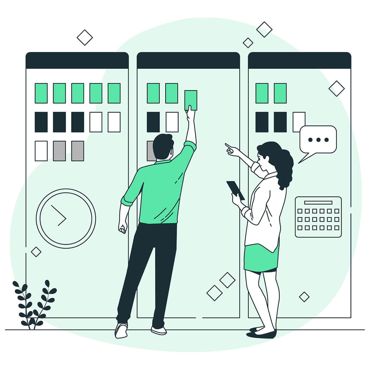
1. Group and prioritize content.
First step: Organizing content
Traditionally, there are two primary approaches to organizing content. The exact/objective view is based on arranging information alphabetically, numerically, chronologically, by geographical location, or even by relevance. However, this strongly discourages users who wouldn't actually know what they are looking for, since only association would lead them to the exact location of the information. That's why for some of the more difficult categorization tasks, it makes sense to follow the subjective way of organizing, which can literally mean anything depending on the issue (e.g. topic, mood, task type, persona-specific aspects, etc.).
Second step: Involving users in the sorting process
Nevertheless, it is evident that we must take our own system design logic as a starting point and then shape it in the light of the user test results we have received. Two great tools can be used for this purpose: tree testing and card sorting. Tree testing involves asking participants to locate hidden information within subcategories, and then tracking how they achieve this (what groups they search in, how fast they find it, whether they find it at all, and if they give up).
Card sorting, on the other hand, requires the test participant to establish relationships between categories and arbitrarily classified elements.This test can be conducted either in-person or remotely using platforms such as OptimalWorkshop. Both methods share the common characteristic of considering 15-20 tests as a representative sample and granting control to the user.
2. Create a sitemap!
A sitemap serves as a good hierarchical system that showcases prioritization, order, relationships and labels of pages. It is recommended to create the sitemap after persona development, user flows and card sorting, as this ensures a clear understanding of who the target audience is, the context in which they interact, and what needs to be made searchable.
When redesigning an existing sitemap, it is essential to map and inventory existing elements and then reorganize them as described below.
Our ultimate goal is to achieve the following:
Exceptional usability
A comprehensive overview of the entire system,
Streamlined and devoid of unnecessary pages,
Prioritization of vital elements
User- and SEO-friendliness
In other words, put the content where the user expects it, and identify the exact elements that are not consciously labeled.
3. Determine the navigation structure!
There are three key areas to consider when it comes to navigation tools: the menu system, breadcrumbs and search/filter functions.
First step: Choosing the right menu system - Top-down vs. Bottom-up?
Besides the traditional top-down navigation, the bottom-up form is also gaining ground, so at the early freedom of the project, we can legitimately fall into a dilemma: which one to go with? Questions such as the number of main functions to display in the fixed menu bar, whether to reduce the most frequently used functions, the device users will utilize, and more, all impact the overall interface structure. A bottom-up layout is justified for a small number of 3-5 item feature lists, while a traditional top-down hierarchy can provide a familiar pattern of how pages are linked, which is ideal for both desktop and mobile views.
Of course, the bottom-up approach has the option of using drop-down drawers where you can squeeze other items into a list, but the top-down approach offers a comprehensive menu, or, on mobile, the hamburger menu can be used.
If we make the choice to design for mobile - which is absolutely justified, as 52% of people surf the web every day and 73% shop on their mobile - a permanent navigation bar closer to the bottom left corner, within easy reach of the fingers, offers a more comfortable and therefore better user experience.
Second step: Breadcrumbs - do we always use them or does it depend?
It is easy for users to get lost on a website, especially when there is no indication of their current location. It is therefore essential to ALWAYS clarify the user's place in the hierarchy of your system, and breadcrumbs can be the perfect solution. However, using breadcrumbs properly is far from obvious. As NNGroup explains: we need to display step by step the real relationship of landing pages, which is not the same as a session history or a depiction of categories and subcategories. Furthermore, the steps should lead to existing pages, avoiding links that lead to empty spaces in drop-down menus, the last step should always represent the last opened page, which cannot be a link, and that the home button should always navigate users back to the home page.
And is there any page where it is superfluous? Yes, there is. Categories with a flat hierarchy or only 1-2 levels of depth do not require breadcrumbs, as it is simpler to navigate using the original menu bar rather than relying on smaller, harder-to-read rows. It is also essential to visually separate active pages that are currently open ( by color, underlining, font/density, etc.) and to keep in mind that shorter pages with less information may be more efficient to navigate without the use of breadcrumbs.

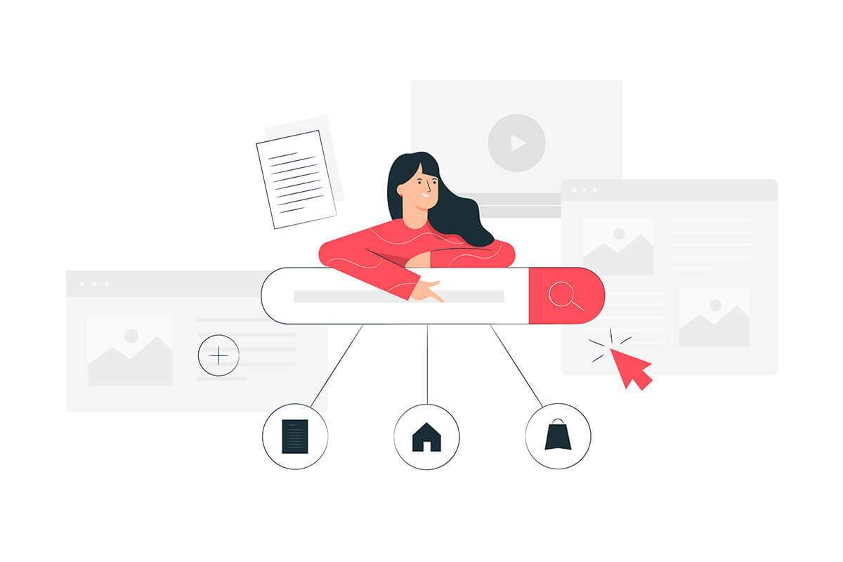
Third step: Filters / Searchers
At the beginning of this article, we discussed the fact that a user's search process can be either direct (knowing what they are looking for) or indirect (only associating); but we must return to this point again, since these two attitudes underpin the relevance of designing keyword search fields and filters by category. When using a search box, the users know exactly what they are looking for, so their expectation is that the search will lead them to a page containing relevant information.
On the other hand, when using filters, users may not find other navigation elements helpful or precise enough, as they only approximate what they need. Once the main category is selected, additional forms of fine-tunable filtering can be used, such as drop-down menus (radio button or boolean true/false search), table header filters, additive filters (which filter a group on a per-setting basis), date selectors, complex filters, which should be fully consistent with the end-users' search logic.

4. Label your content (subtitles, texts for UI elements)
In this section, we are referring to various types of content, such as buttons, links, keywords, tags, titles and subtitles. When labeling these elements, it is recommended to implement principles based on the global rules of copywriting. These principles include being precise, concise and meaningful, ensuring that the content is easily understandable to the user (using user-friendly language), aiming for the shortest and most efficient solutions, and maintaining consistency with the brand’s tone of voice.
You can get to know the users' voice by browsing the site's search log, by looking up competitors, or by conducting specific interviews with users. The stakes are high: the user either gets a sniff (information scent) or leaves (bounce rate vs quit rate).

Summary
All in all, a solid, well-designed interface that represents the user's logic is the core of a good user experience. The ultimate goal is to provide users with a quick and mentally stress-free journey that satisfies their curiosity.. While the list above serves as a good starting point for analyzing existing products, it is also beneficial for making structural decisions in new projects. It is important to note that “everything is product and problem dependent", meaning that there are no universal solutions.
However, by keeping two key thoughts in mind, we can navigate even the most challenging dilemmas. These thoughts are:
The user should always be top priority.
Simplicity leads to a better experience.

By prioritizing the user and striving for simplicity, we can overcome any obstacle and create exceptional user experiences.
This post was written by Kitti H. Óvári, UX Designer at Danubius IT Solutions.
References:
Rosenfeld, L., Morville, P., & Arango, J. (2015). Information Architecture, 4th Edition. Sebastopol, CA: O'Reilly Media, Inc.
Krug, S. (2013). Don't Make Me Think, Revisited: A Common Sense Approach to Web Usability (3rd Edition) (Voices That Matter). San Francisco, CA: New Riders.
Laubheimer, P. (2018). Breadcrumbs: 11 Design Guidelines for Desktop and Mobile. https://www.nngroup.com/articles/breadcrumbs/